A practical guide from Music X Lab. Adapted from the original collaborative manuscript; examples and recommendations retain the authors’ original wording.
(You usually need to use “anonymous” on submission if it is required by the conference. If it’s the first time for you to write a paper, share with your group a google doc template of the conference. If you are experienced writer, feel free to directly work on overleaf.)
Abstract
This is a guideline on how to write a Music AI paper in Music X Lab. Please read it carefully, especially if it’s the first time for you to write a computer-music paper for ISMIR, NIME, ICLR, NeuriPS, or a related conference. In this guideline, we will show you the key points to cover in each section of the paper, as well as some common mistakes you should avoid. Hope you find this guidance helpful. In general, the abstract should be a short summary of the intro, the intro is a summary of the whole paper, and your title should be a one-sentence take-away message of your abstract.
1 Introduction
Introduction is a short “story telling” about your research. A clear and concise logic flow is the key to a successful introduction — you should make the length of the “chain of logic” as short as possible, and try to introduce fewer concepts. As lengthy logic flow with many new concepts are hard to understand. When introducing new concepts, keywords or even the key statement shall be in italics when (and only when) it appears the first time. Sometimes, you can re-emphasize them using italics when it appears again in a new section (say, Methodology).
In general, a chain of logic contains the following parts: 1) a general background of the field and its current focus, 2) the main problem of current approaches, 3) your novel solution, and 4) main results. The third part is a summary of the methodology section, and here you only need to highlight the high-level ideas. The fourth part is optional, but it’s usually included in the intro. At the very end of the intro section, we usually re-state our contributions as bullet points. (It’d be helpful to read at least 1-2 previous papers, especially the ones sharing a similar topic, to get some concrete ideas.)
For an excellent paper, its introduction is by itself enough to win an acceptance. The reviewer is already convinced by the story, and s/he only needs to double-check the experiment to make sure there are no major flaws.
Please start to draft the intro at least 3 weeks before the paper deadline. (if you are an experienced writer, maybe you can do it 10 days before ISMIR ddl and 2 weeks before ICLR). Seek Gus for help/edit on this part as early as possible, since the structure as well as the terminologies used in the intro will be unfolded and reused in the rest of the paper.
2 Related work
Related work is usually arranged after introduction. In special cases (when it’s a super innovative study and there are very few related papers), you can put related work before conclusion. Also, if the paper is short, say a 4 paper ICASSP paper, you can merge related work with the intro. In this section, we will first talk about the structure of related and then discuss some common issues.
2.1 Structure of related work
We need a very brief paragraph to summarize the content of the whole section between 2 and 2.1. The previous short paragraph (related work is usually … common issue) is an example. The same idea also applied to every following sections. After this structural summarization, you dive into each topic of related works.
2.2 Content of related work
In the related work section, you usually summarize the works in concise words. You don’t have to mention each aspect of the papers but need to highlight the points that are related to your study. When you cite a work, don’t use “[ref No.]” to begin a sentence, instead try to use the system/model name (e.g. Transformer) or authors names (Chin et al.).
2.3 The Essence of “Related”
The essence of related work is not only to show or list the existing works, but more importantly, to highlight how your study is different. The differences should be conveyed in a very concise way.
Methodology
There is actually no clear Cliché (or 套路) for a good methodology. It is the actual content of your research and of course each study is so different. In many cases, you first talk about data representation and then talk about the model architecture (but things can be highly customized).
Model architecture
The model graph is usually the most important part (at least the most important picture) of your paper. Many people in your field are going to directly jump into the model graph after reading the abstract. So, the model graph should be a clear “graphical abstract” of your method, and the caption itself should be enough to explain the figure.
How to draw nice graphs
Why do we need these figures? Because Figures can attract human’s eyes, and understand the paper easier. Research has shown that the level of difficulty in understanding different elements follows this order: images < tables < text < pseudo code.
- Try to use a teaser figure on the first page! Then people will look at it immediately after reading the title. It can be very simple, just showing your workflow, or a concept graph, or example.
- You will need an architecture diagram. It should be understandable, even can let people skip the methodology section at the first glance.
Here is the correct order that help you make a figure easier.
- Decide this is your workflow or your architecture. Mixing them may be confusing.
- Decide it is a single column graph or a double column graph. It decides the direction of your figure.
- Prepare a piece of paper. Draw a rectangle. Decide your core component in small rectangles. Place small rectangles into large rectangle. Modularity is always good. Put your hierarchy mind here.
- Fill the main details. Always draw the most important elements first. It is okay not put everything insides. Put those details into your captions.
- Open your preferred software.
- Diagram: draw.io
- Color: coloors.co (do not use default colors)
- Icons: thenounproject.com
- For each small rectangle, keep them in a harmonic color scheme. It is okay to use different style across small rectangles. Use shallow colors as background. Use dark colors as text and components. Never use big red, big green, big blue, etc. Keep the color not that sticking.
- Check it again. Keep the structure balanced. Align elements. The design should not be too narrow. Make it relaxing. Keep the text bigger if possible.
- Write your captions. It should be detailed enough, including a brief introduction of every small rectangle.
Please refer 刘洋 学术论文.pdf for a more detailed guidance.
Generated example
If your work is about music generation, especially in the symbolic domain, it’s better to show generated high-quality examples in an individual section. Examples are poly-dis, audio-to-symbolic, and whole-song-gen.
The score should be well-formatted. First, pay attention to the general formatting issues. Here is a non-exhaustive list of things you should pay attention to.
- Clefs (are they missing in screen shot)
- Time/key signatures (Are they correct? Are they missing?)
- Barlines (are they missing? Make sure the last bar in your screen shot should be ended with a barline)
Then, take care of the note-spelling, note durations, and voices. Even though we usually generate MIDIs or so-called symbolic scores, where such information is usually missing, we have to infer it, because otherwise the score is not readable. We can use a footnote to mention what information is inferred. See the sheet music below, it’s not readable at all, worse than a piano-roll. (Also, do you notice the background color of this figure is not white? It should be avoided as well.)

Finally, try to make some analysis directly on the sheet music if necessary. In my experience, this is the most efficient method. If you try to write analysis elsewhere, you will use additional space. Remember the sheet music already costs you a lot of space.If you are not certain about the wording, consult your colleagues.
In conclusion, using sheet music in symbolic music generation is an effective way to demonstrate your sample quality. Although whether conventional music notation is suitable for all music types is debatable, this is one of the few methods that musicians can read. Other music formats are just unreadable. It also demonstrates you are a well-trained computer music scientist and you care about music.
The softwares to use are: Musescore/Finale/Sibelius for score editing and Microsoft Powerpoint for post-editing.
Experiments
Dataset
The dataset section usually contains one subsection with the title “dataset” or “datasets,” or more subsections in case of complicated routines either in data collection or preprocessing. In any cases, the dataset subsection(s) should contain the following content:
- Introduction: start with a brief description of the dataset you use. I.e., We use a Chinese pop music dataset POP909 [citation] to train and evaluate the model. Most relevant information includes the format (e.g., audio recordings, or multi-track performance piano MIDI), size (number of songs and the total length) and genre distribution of the dataset. Introduce each dataset in one or two sentences.
- Visualization: if text-based introduction is hard to make sense, provide a visualization of one or two samples in your dataset. If space is limited, consider merging it with a plot in “case study.”
- Source: properly reference the source of self-collected datasets. Describe them in detail if they have never appeared in previous literature. If you feel it necessary, provide a simple reason why existing datasets fail to meet our requirements and we have to create our own. Avoid listing too many reasons, since the readers might think you are not confident enough.
- Crawled datasets: clearly state the website/CDs/books you collect the data from and how you collect them (e.g., batch-downloaded using a specific genre filter). Provide a footnote to a project repo which details your crawled dataset. If the crawled dataset itself cannot be made publicly available due to copyright issues, in your project repo, provide a URL list to the songs you collected (e.g., if you got songs from Youtube) or a rough stepwise guidance to crawl the datasets.
- Self-created (recorded or annotated) datasets: clearly state the recording (annotation) environment (i.e., audio recorded on an Roland-XXX player piano in a large auditorium, audio synthesized with the FluidR3 soundfont [cite], labels annotated with Sonic Visualizer [cite]), how many people participated in the recording (annotation) process, the musical background of the players/annotators (i.e., amateur, intermediate or expert), the recorded (annotated) formats, and other important setup information. Always keep in mind that the reproduction of an identical recording environment or materials is often very hard for other laboratories. It is very useful to write down important setups in the paper, and make your recorded (annotated) datasets publicly available after your paper is accepted.
- Data pre-processing: Describe all data pre-processing techniques used. If necessary, you may split it into one or more subsections.
- Dataset clean-up: If necessary, briefly describe how you filtered out illegal or dirty samples in the dataset.
- Feature representation: Describe in detail how you transform raw data (audio, MIDI or score) into the features (spectrogram, piano roll). Write all hyperparameters you used associated with the transformation. Example list of hyperparameters:
STFT Spectrogram: Sample rate, hop length, window shape (only if you are not using hanning) and window size.
CQT Spectrogram: hop length, quality factor, base frequency, number of bins, number of bins per octave
Piano roll: time resolution, how you represent onsets/sustain/rests
Piano tree/REMI/Compound word etc: citation to the original paper, changes you made compared to the original paper
Notice: DO NOT WRITE THIS SUBSECTION IN YOUR METHODOLOGY SECTION. The best practice is always to write your methodology as general as possible, and your experiment as specific as possible.
- Data augmentation: Describe in detail how you augment the data (along with the hyperparameters). E.g.,
- Pitch shifting: e.g., from -6 semitones to +5 semitones
- Time stretching/resampling: e.g., from x0.8 to x1.25
- Random truncating: length in seconds or length in beats, number of samples per song (in each training epoch)
- Noise addition: what kind of noise, what SNR
- Random note addition/deletion: you may omit some details (be sure to open-source your code) and just say randomly delete/add x% of notes
- SpecAugment, remixing etc: cite the original paper that proposes this augmentation method and write important hyperparameters you overrode
- Dataset split: Write how you split datasets into the training/validation/test set (e.g., 80% for training, 10% for validation and 10% for testing). It is not recommended to go without the validation set. If multiple samples may come from the same song, mention whether you randomly split the dataset on a song level (correct) or on a sample level (incorrect). If you do cross validation, write down how many folds (usually 5 folds to 10 folds) you used.
If available space is extremely limited, consider retaining the most important descriptions of the dataset only (e.g., format, genre distribution, and a simple citation to the source) to make the following parts of experiments make sense to readers. Expand your dataset description in your supplement materials and/or your repository.
Experiments (methods, objective metrics & writing)
Both objective and subjective evaluations are to prove that our model does excel at its selling point. You cannot simply brag without providing scientific statistics. First, we should find out what baseline models should we compare to, and what metrics suit our demonstration best. This applies to both objective and subjective evaluation.
- According to the selling point of your study, find relevant baseline models that achieve similar goals. E.g., for symbolic music generation study, you can find Music Transformer, REMI, MuseCoco, MMT, MMM, FIGARO, PopMag, Polyffusion, etc., each with varied focuses (controls, multi-track, performance, arrangement, etc.). If your selling point is quality and controllability, FIGARO, REMI, and Polyffusion might be a good start.
- You can borrow the metrics from the papers of those baseline models! E.g., for symbolic music generation study, FIGARO provides comprehensive controllability metrics, PopMag has some good musicality metrics.
- Your model design may already provide several internal/specialized/common metrics to use! E.g., if you are using fixed-length models like Transformer, Perplexity (PPL) is commonly used to measure fluency. If your model contains several internal interpretable layers, you can prove their efficacy accordingly.
- In case you need to design a new objective metric, try to find similar metrics that deal with different objects, but whose calculative methods can be borrowed. E.g., many objective metrics can be regarded as the similarity / distance between two objectives (cosine similarity, distribution similarity, l2 distance…).
Now we have a list of baseline models and metrics. Let’s do the writing!
Evaluation Intro. It’s recommended to write an intro paragraph that summarizes the logic of the evaluation part. It should be concise and clear, stating the tasks (objective and/or subjective experiments) and the reason of such experimental design. If it’s a hassle to explain, you can also design a table that lists all the attributes (tasks, metrics, baselines) like this one in Polyffusion:

Evaluation Metrics. Next, elaborate all the subjective and/or objective metrics in each task. Give them good names (perhaps abbreviated) or symbols. When writing detailed implementation, refer to another paper if it is borrowed, or put down with words/equations if it is original or modified. If it takes too much space to explain, you can put extra details in the appendix.
Baseline Models. Then, elaborate the baseline models we compare to in each task. Briefly summarize their model design and what they achieve. Usually, citing the original paper with a bit of explanation will be enough, but do mention the implementation difference if you have tweaked something (e.g. model trained on a custom dataset, parameters adjusted, etc.)
(Optional) Ablation Study. Ablation studies are the experiments where you remove some designs/tricks from the proposed model and test its performance. In short, you may have some special baselines that are the reduced variations of your own model! This is especially important if you have a complicated pipeline, or if you want to emphasize the necessity of these designs/tricks.
Design a Good Table. Now you have got a bunch of data from the objective experiments, let’s put them into a nice table.
- Read the LaTeX guideline of your target conference first. They provide detailed styling for tables/charts that authors must adhere to. E.g., IJCAI suggests authors to use \toprule, \midrule, and \bottomrule for better border styling in tables. Also notice where the table caption should be. (usually on top of the table, while for figures the captions should be at the bottom.)
- There are some awesome online tools for creating LaTeX table! I use this one to speed up the process, where you can paste multiple columns and rows from Excel and easily adjust the styling.
- (Just my suggestion) Avoid drawing unnecessary borders. Usually, horizontal split lines are clear enough for dividing the content. Use vertical split lines when there are multiple tasks or groups.
- Use visual hints to make it easier to comprehend.
- \uparrow and \downarrow after the metric to indicate “the larger/smaller, the better”, respectively.
- As a convention, make the best statistics bold.
- (Just my suggestion) Have a slightly different background color for Ground Truth using \rowcolor from the xcolor package.
- Abbreviate the terminologies/model names if they are too long to fit the page width.
Here is an example from Whole-Song Generation:
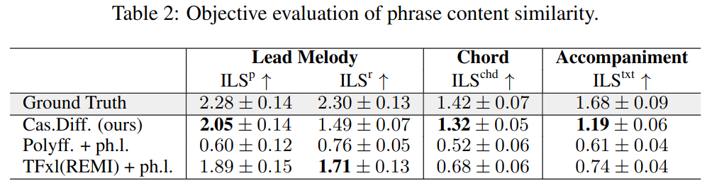
Comparative Results. It’s the time to draw a conclusion: your model does beat the baseline models! If not all baselines on all metrics, at least in some ways.
- Let the data speaks. Grab the most essential message in the data and convey the positive conclusion in an objective tone. E.g., your model outperforms the baselines in several metrics, which indicates something does work better.
- Try to give a plausible explanation for something counterintuitive/worse than the baselines.
Subjective Evaluation and User Study
If your work is about music generation, you probably need to do a subjective evaluation. Music X Lab has its established way of doing it. You can refer to EC2-VAE as a simple example. Later work may get more complicated but the methods keep more or less the same. In this section, we will show you how to design the survey, collect & analyze the data, and plot proper graphs to show your results. Python scripts mentioned in this section can be found here and here.
What a Survey Should Look Like
For subjective evaluation, we typically want to compare models (including ours, baseline(s), and optionally ground truth) based on metrics. Suppose we have generated samples for each model, and now we will need to create a survey for evaluators to listen, compare, and rate.
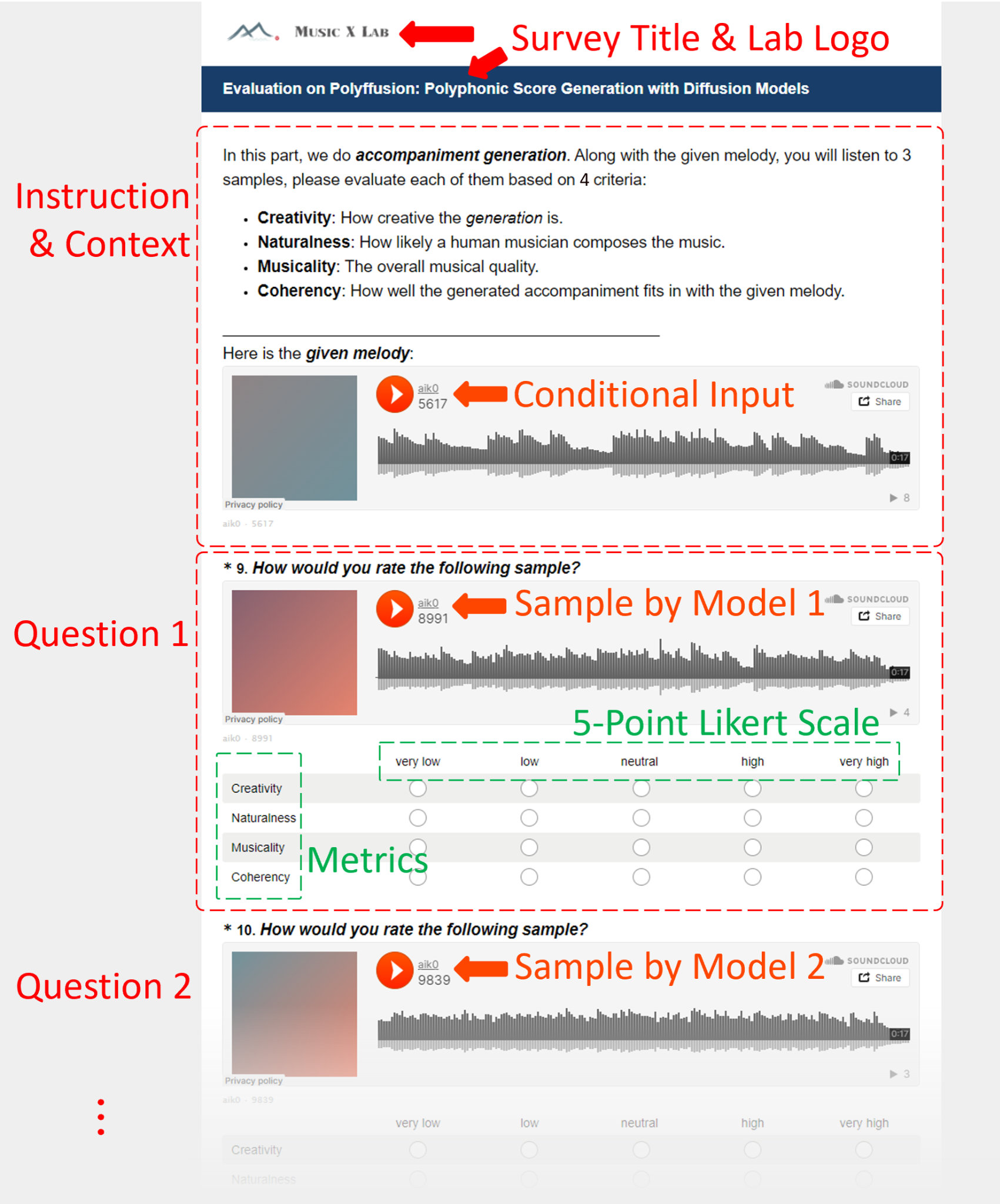
In a nutshell, the survey should have a total of pages and each page should have questions for respective models. Within each question, evaluators should be able to listen to the sample and give ratings for respective metrics on a 5-point Likert scale. Note that if your task is conditional generation, then the samples in one page should be based on a common conditional input. For example, Figure 4 shows one partial survey page for Polyffusion on the task of accompaniment generation. There are accompaniment samples/models based on the same conditional input (a lead melody in this case). They will be evaluated based on metrics: Creativity, Naturalness, Musicality, and Coherency. The melody condition is also provided as context together with the instructions at the beginning of this page.
Survey Creation
In this section, we will talk about hands-on practice for creating a survey. The premise for survey creation is that you have rendered generation samples in a playable media format and hosted them on a media-sharing platform. With samples ready, we will use SurveyMonkey to design and distribute surveys under a subscribed account by Gus. In the following, we will go through the complete survey creation pipeline from sample rendition to survey design.
Sample Anonymization: It is very helpful to use an intuitive file naming scheme for generated samples, such as sample01_ours.mp3, sample03_baseline.mp3, sample10_groundtruth.mp3, etc. However, it will be very awkward if we leak this prior message to the evaluator. What we should do here is to 1) make a copy of each sample, 2) rename the copy based on a 4-digit random number, and 3) save a check table for corresponding anonymized and original sample pairs (important!). We will provide one Python script for this anonymization. To put samples onto the survey pages, you will consult the original names to make sure of the sample order, but the exact file to put on should be the anonymized version.
Sample Rendering and Hosting: If your generated samples are MIDI, then typically you will need to synthesize them as mp3 audio. Such a synthesis can be done in bulk using midi2audio but the sound quality may be limited. It is recommended to use BandLab (a free web client, if you do not have a DAW set up), where better sound fonts will be provided. However, you’ll have to do it one by one manually. After rendering, it is recommended to upload the anonymized mp3 files to SoundCloud, an audio hosting/sharing platform. From there you can generate a sharing link for each file that can be further embedded to the survey pages. Refer to the python script to automate your GUI to batch copy the embed codes from Soundcloud.
Survey Creation Quick Start: On the home page of SurveyMonkey after login, you will see a listing of a few previous surveys of Music X Lab. To quickly start your own survey, you can select the template survey, click the Options button (or on the right), and click Make a Copy. This will make a copy of an already established survey and you just need to make modifications to that. On the 1st page, you can set up the survey title, lab logo(s), and welcome messages. The 2nd page typically aims to collect relevant information from evaluators; you don’t need to modify anything.
Edit Question Pages: The 3rd page and after that will be question pages. Each question page starts with an instruction block followed by a few question blocks (one question for one model). You can edit each block by clicking on it. A more specific guidance is as follows:
- Edit Instruction Block: The instruction block contains instruction texts telling evaluators what to do and briefly defining the evaluation metrics. You may need to discuss with Gus about what metrics to apply and how to define them for specific tasks. For conditional generation tasks, the conditional input should also be included as an embedded audio.
- Edit Question Blocks: For each question block, you should 1) update the embedded sample audio; and 2) update the evaluation metrics. If you need more questions on one page, you can copy existing question blocks and then update the audio and metrics in that copy. You are not encouraged to make other modifications or create new questions from scratch just in case certain unwanted features are triggered.
- Maintain a Consistent Question Order: If the question order on your 1st question page is, say, ours, baseline_1, and baseline_2 (note that questions correspond to models), then this order should be exactly maintained for the rest question pages. The reason is to facilitate post-survey data analysis. Note that the audio files to be embedded are anonymized and you should check the original names to make sure of the order.
- Question Randomization: SurveyMonkey offers a useful feature to randomize the question order on the evaluator’s side when they fill out the survey. This would help enhance objectivity. Yet on our side, the questions should be arranged in a consistent order as mentioned before. To enable question randomization, on the upper right of each question page, click Page Logic -> Question randomization. Make sure that all the question blocks are selected and that the instruction block is not selected.
- Make Use of Page Template: After setting up the 1st question page, you can copy it and use it as a template for the rest pages. In this template, we have already set up all necessary features (e.g., number of questions, metrics, question randomization, etc), and you will only need to update the embedded sample audio.
Early Finish with Concluding Page: The best suitable number of question pages in a survey would be 6 ~ 10 pages if not more. That could be a lot and hence we do not expect evaluators to finish all of them. Considering a feasible workload (say, 10 ~ 20 minutes), we can let evaluators conclude the survey early by inserting a concluding page. For example, we can let evaluators just fill the first 3 question pages by inserting a concluding page after that. We then enable page randomization so that all 10 question pages will have a chance to be filled.
Page Randomization: SurveyMonkey offers a useful feature to randomize pages on the evaluator’s side. This feature is helpful when we only require evaluators to fill, say, the first 3 out of 10 question pages. With page randomization enabled, each page will have a chance to appear earlier on the evaluator’s side and hence be filled, regardless of its absolute page index on our side. To enable page randomization, on the upper right of any question page, click Page Logic -> Page randomization. Make sure that all question pages are selected and that the welcome page, the information page, and the concluding page are not selected.
Survey Preview and Distribution
Note that there is a taskbar, as shown in Figure 5, on top of the survey design panel. During survey creation, DESIGN SURVEY is selected. After survey creation, you should click PREVIEW & SCORE to preview and try out your survey. After preview, you should click COLLECT RESPONSES to distribute your survey.

Survey Preview: It is always good to preview and try out your survey before distributing it to the public. During the preview, you should go through the complete survey to make sure that the following features are well-functioning:
- No typo that may cause distraction or confusion;
- Audio files are correctly embedded and are playable;
- All questions are compulsory questions: make sure that the evaluator cannot go to the next page if any metric in any question is not rated on the current page;
- One answer is allowed per row;
- Page randomization and Question randomization are correctly set (note that during preview, you will view the survey on the evaluator’s side).
- Make sure that the survey ends at the concluding page.
Survey Distribution: Click COLLECT RESPONSES in the taskbar, and then click Send surveys your way. You will see a range of options to distribute your survey, the best of which is probably to Share a survey link. You can send this link to quite a few targets such as:
- WeChat
- Research: NYU风格伴奏编配
- 全球音乐技术学生交流群 (Ask Yixiao or Ziyue if you are not in the group)
- Your WeChat Moment
- Mailing list
- Music X Lab mailing list [Ask Gus to Join]
- ISMIR mailing list [Click to Join]
- NIME mailing list [Ask to Join]
A few things to notice:
- If you share your survey with a WeChat group, you may consider sending a red packet as an incentive to attract more people to help with the survey.
- If you decide to share with the ISMIR/NIME mailing list, you should be aware that these are formal channels. Make sure that your survey is well prepared.
Analysis with ANOVA
Recall that our survey has a few pages and each page has questions regarding respective models in a consistent order. Each question has metrics and each metric will receive numeric ratings from 1 (very low) to 5 (very high) from evaluators. Now suppose our survey receives a total of ratings for each metric of each model. This results in a tensor of shape . That is, for each metric, we have a rating matrix of shape . After calculating the mean rating for each model, we need to further calculate the deviation (i.e., error bar) and assess the statistical significance. Here the deviation comes from two sources:
- Various standards from different evaluators (inter-subject component);
- Intrinsic randomness (within-subject component).
Specifically, the inter-subject component is an irrelevant term which tends to be very impactful (resulting in a large error bar), so we wish to detach it from the within-subject component. To realize that, we resort to within-subject ANOVA.
In this subsection, we discuss hands-on practice in the analysis of the exported survey results. We will not mention much of the mathematical foundations of ANOVA but we refer readers to a few reference textbooks to explore more insights and reasoning behind this art.
Export Survey Result: Recall the taskbar on top of the survey creation panel. Click ANALYZE RESULTS -> Save As -> Export File -> All responses data. Then you will see a pop-up window asking you to configure the export format. In this window, set FILE FORMAT to CSV (you will need to post-process the exported spreadsheet). Other options should be left default. Then click EXPORT -> Download.
Exported Spreadsheet: The exported result is a spreadsheet with condensed response information. The first 13 columns (A to M) record IP, timestamp, and other information of evaluators (one evaluator per row), which usually can be safely discarded. After column M will be the ratings. Each column records the ratings for one metric of one model on one page. This spreadsheet traverses each page, model, and metric in a depth-first manner. Since evaluators may not complete all pages, some cells may be empty.
Post-processing: Suppose we have metrics and models, and our survey receives a total of ratings for each metric of each model (note that is not the number of evaluators. One evaluator can give several ratings to one model on different survey pages). For post-processing, we need to identify the non-zero entries in the spreadsheet and arrange them into tables of shape . Specifically, we have one table per metric. This can be done using Python scripts with Pandas. In each table, the row corresponds to rating instances (i.e., rows) and the column to models ( columns). You should know which column corresponds to which model. There should be no empty cell in the processed table. Meanwhile, the string-based ratings [‘very low’, ‘low’, ‘neutral’, ‘high’, ‘very high’] should be converted to integers [1, 2, 3, 4, 5]. We will provide one Python script for this post-processing spreadsheet conversion.
Mean Rating: You can save the tables as tabs of an Excel spreadsheet. Then the mean rating (for each model) is simply the average of each column.
Within-Subject Anova: In each Excel tab, click Data in the taskbar, and then click Data Analysis. Select Anova: Two factors Without Replication and then click OK. A configuration panel will pop up. For input range, you should select the table with integer ratings. Set Alpha to 0.05 (by default). In the Output options, select Output Range and then click anywhere in the tab to print out the analysis result. Then click OK. The ANOVA result is a table as shown in Figure 6.
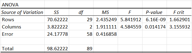
Interpreting Anova Results:
- Statistical Significance: If the (Columns, P-value) cell has a value smaller than 0.05, it means there exists a significant difference among different columns. That is, at least one model has a significantly different rating from the others. However, it does not tell us which exact model it is. We cannot yet say our model is significantly better. Rather, we have to check if the lower error bar of our model is sufficiently higher than the upper error bar of all the baselines. If so, then empiracally we can claim that our proposed model gains a significantly better performance than the baselines. If the p-value is larger than 0.05, or if the error bars have a large intersection, then we can only claim a marginally better performance. Alternatively, in a more rigorous manner, you can conduct ANOVA on binary pairs between Ours and each baseline model. You can claim significantly better performance if p < for each pair (using the Bonferroni correction when multiple tests are performed).
- Error Bar: We compute the standard error of mean () as follows:
,
where is the value of the (Error, MS) cell in the ANOVA table. is the number of ratings. Note that is not the same thing as standard deviation (). In general, . The indicates how much the mean ratings would likely vary if we were to repeat the experiment. The lower , the more significance there likely to be (note that it is only a correlation, but we cannot simply tell the statistical significance from ). By using the computed by ANOVA, is shared by the mean ratings of each model under the same tab (metric).
References on within-subject ANOVA
- Repeated Measures ANOVA. [link]
- Two Factor ANOVA without Replication. [link]
- H. Sahai and M. I. Ageel. The analysis of variance: fixed, random and mixed models. Chapter 3, pp. 125-168. Springer Science & Business Media, 2012. [link]
Plotting Results
For each of the metrics, we will get mean ratings with a shared error bar via within-subject ANOVA. Now we will showcase this result using a bar plot. An example is shown in Figure 7. Here, we have metrics (Creativity, Naturalness, and Musicality) and models (GT, Trf., Polyf, and Samp.). The y-axis represents the range of the Likert scale (1 to 5). The x-axis lists the models under each of the metrics so that we have a straightforward comparison among the models regarding each metric.
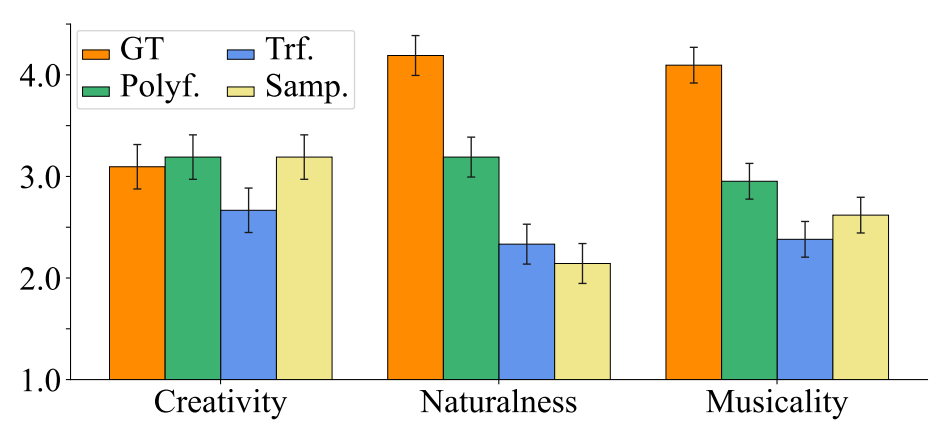
To create such a plot, typically we can apply the Matplotlib package in Python. Specifically:
- import matplotlib.pyplot as plt
- Plot mean ratings using plt.bar()
- Plot error bars using plt.errorbar()
- Add a legend by plt.legend()
To make a visually more elegant plot, you can use Seaborn together with Matplotlib in a combo. You are encouraged to explore the documents and other resources (e.g., Stack Overflow) of both packages to write your own plotting script. We will also provide one Python script.
Conclusion
Conclusion seems to be a re-statement of abstract, but a good conclusion is much more than that. You can incorporate a broader context of research in the writing, linking the study to some other important studies that seems far away but in essence very related from your own unique perspective. You can also point out the limitations and future work here, if there is no individual session for that as per required by the conference.
Appendix
The policy on code, demo, and presentation maintenance
Demos:
1. Put only paper-mentioned demos on OVERLEAF E.g.: if you show the score of a generated piece in your paper, you should put the corresponding MIDI files on overleaf under the ./demo folder.
2. Put all demos on GOOGLE DRIVE under AccArrangement/presentation_demos_upload.
3. Timeline: Demos are encouraged to be uploaded shortly after paper submission and no later than one week after the camera ready.
Presentations:
1. Put all presentations (slides, poster, and video recordings) on GOOGLE DRIVE, one paper per folder. Please include both pdf and source files (pptx, keynote) for slides. Slides 里最好直接嵌入demo里的音频, 尽量不要用record+定时播放slides功能。
2. Timeline: no later than the formal presentation.
Codes:
1. By submission: You should have your own git repository.
2. By camera ready: The repository should be clean enough, shared to the public, and include a link to the demo page or google drive demo.
Try your best to release the trained model and dataset, unless the dataset has a copyright issue.
Be sure to include the repository link in the camera ready paper!
3. IMPORTANT: By formal presentation, the Music X Lab git should link to the project repo
How to make a good demo page
This might not be a comprehensive guide, but rather several recommendations that I find handy to use.
GitHub Page. This is probably the most convenient way to deploy a lightweight static website. To deploy a GitHub Page for a paper submitted to a double-blind conference, the following steps are necessary:
- You should register a new GitHub account with a good account name (e.g., “polyffusion” for the polyffusion paper), and USE A EMAIL ADDRESS THAT PEOPLE CANNOT EASILY GUESS THE OWNER (e.g., a newly registered QQ email is just some random numbers, which is good for this purpose).
- You probably need to add an ssh key to the new anonymous account, unless you choose to upload/change website code directly in the browser.
- Create a repository named “{accountname}.github.io”. This is a special repository that enables Page deployment.
- Clone this repo to your machine. In your cloned repo, you should configure your local git information to match this anonymous GitHub account. This is the key for GitHub to recognize you as the new anonymous account instead of your personal account. Execute these commands in the shell (git shell, cmd, bash, etc.):
- git config user.name {accountname}
- git config user.email {acountemail}
- After you push your code to the GitHub repo, take a look at the repo panel to make sure your personal account does NOT appear in the “Contributors” list.
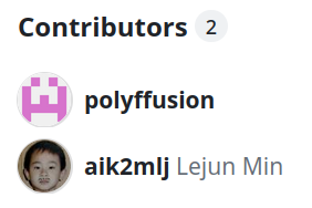
This is bad! You expose yourself!
- After the paper is deployed by GitHub, take a look at your webpage at
https://{accountname}.github.io.
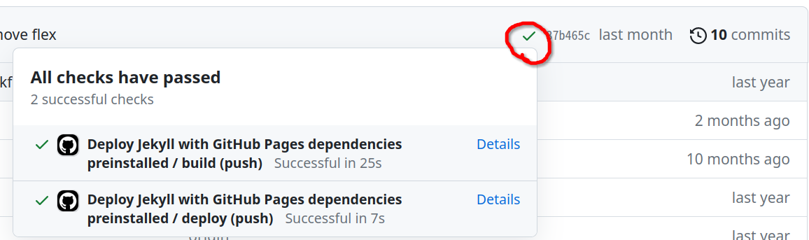
This tick means the page is ready!
Templates for GitHub Pages. Jekyll (which is the static website generator GitHub uses as default) has a good community that has made many templates for different uses. Here are some templates I found suitable for academic purpose. Of course, for a one-page demo website, you can always write HTML/CSS from scratch without any theming. This is up to your liking!
- Minima: an official Jekyll theme that provides a one-page minimal writing environment. (used by Polyffusion and Whole-Song Generation)
- Al-folio: a popular academic blog theme used by many CMU courses and conferences.
- Bear: a minimal, text focused Jekyll theme.
- Browse all the templates if you haven’t found your favorite.
Goodies for Musicians. Some useful tools for a music demo page!
- html_midi_player: 🎹 Play and display MIDI files on the web. They now even have a python launcher! For some advanced styling (centering, bar lines, phrase divisions with background colors), you can take a look at the discussions and the Whole-Song Generation repo.
Discussion
Join the conversation with your GitHub account.